
Pay 2 Win: Does Money Talk?
Does money in college football really equate to more wins?
Introduction
Even though college sports doesn’t envolve schools paying athletes (at least according to the rules, and disregarding NIL) it still seems sometimes like the schools with more money (budget / revenue) seem to win more. At least in college football anyways. They hire good coaches and have nice facilities that attrict higher calibur athletes. But does this actually mean that they win more? To me it seems obvious that it does, but one recent team shows me that it may not be true, which is also why I decided to dive into this topic further. The example team is the Texas Longhorns football team. As of last year the Texas football program had the largest football budget of any college football team in the nation, and according to CollegeRaptor it was by 10 million… Yet their record last year was 8-5, or a 61.5% win percentage, or a D-.
Data Collection
I found the first part of my data from a public github repository called tidytuesday on the rfordatascience github page. The data was from Week 13 in this project. This is a huge dataset and I definitely don’t need all of it, but we’ll clean it later. The second part of the data that I needed is the record for each team for each year that I am looking at. I was able to find that informaiton from this website. I decided it was okay to scrape this data because it was publicly available without needing to create an account. However the site does provide a way to contact the creator of the website if needed. I was able to manipulate and join these two pieces of information to form a sin2%gle dataset for this project. After exploring the data I created this visualization that sums up the answer to my question:
What do you think?
(note: Size of the circle is the average budget/revenue over the last 4 years, and tempurature color is the average win percentage over the last 4 years, more red = higher, more green = lower)
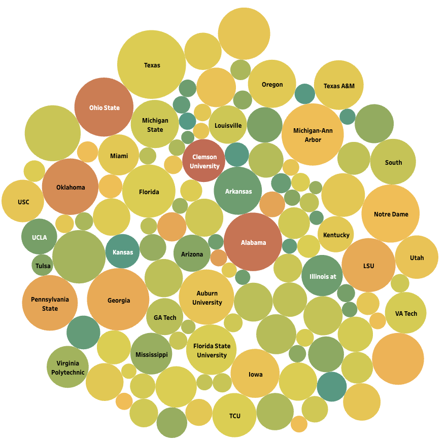
Lets start with the obvious. In the upper left is Texas and as we expected, their bubble is the largest which indicates the largest budget/revenue. All of the smaller bubbles are smaller teams with smaller budgets and not-so-good average win percentages. You can view an interactive version of this visualization on this Tableau site. Here’s the biggest thing that suprised me though was Clemson. Clemson is a well known ACC school. They have three national championships in football, with the most recent coming in 2016 and 2018. Yet their average revenue is almost 50,000,000 less than Alabama, who everyone generally thinks is the team that wins the most, and their average win percentage over the last 5 years is 2% better than Alabama, and 4% better than Ohio State. Those may seem like small differences, but those that know college football know that 1 loss can have a huge impact on the outcome of a season and potential playoff eligibility.
So in general we can probably say that a higher budget gives a better chance for wins, but I don’t think we can conclude for certain that just because a school has alot of money for football, doesn’t mean that they’re going to have seasons with 10 plus wins.
If you’d like to look further into this project feel free to visit this Github repository. Thanks for the read!